Posts in Category: My Photography
Black Creek Pioneer Village – Symmetry / Flash Fill Challenge
I missed last week’s symmetry challenged so I combined it with this week’s flash-fill challenge.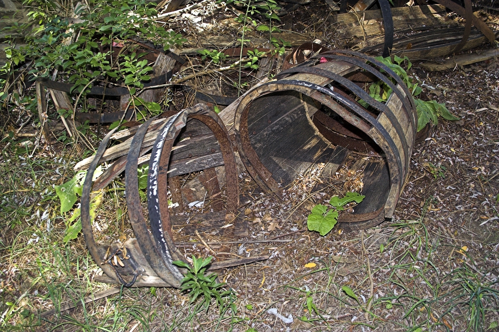 Two Halfs Make a Hole (mirror symmetry)
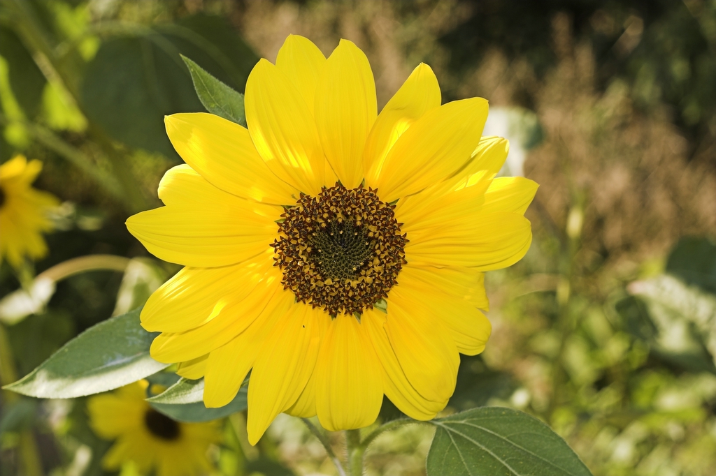 Mellow Yellow (angular symmetry)
This is the closest to multi-scale symmetry (related to fractals) Example: where magnified shape of the edge of the beach looks similar to the beach shoreline, looks similar to … the coast line. This type of symmetry really interests me but my close up lens hadn’t arrived yet so I could not capture it down to the degree I would have liked to get.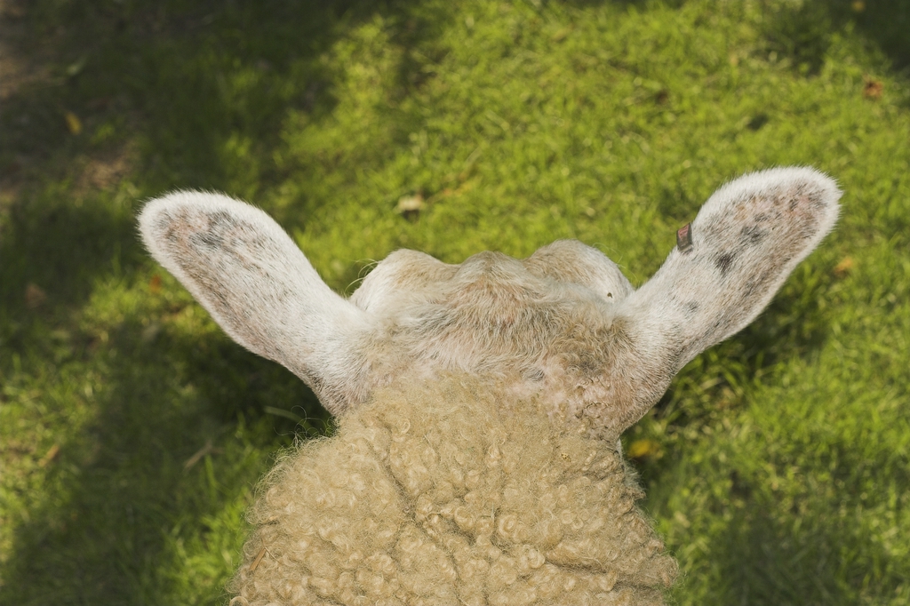 What Sheep Look At (mirror symmetry)
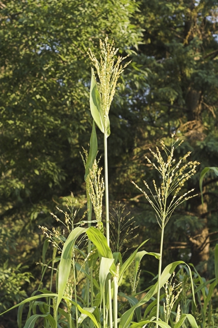 Harvest is Near (fractal symmetry)
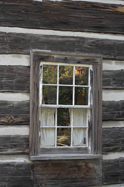
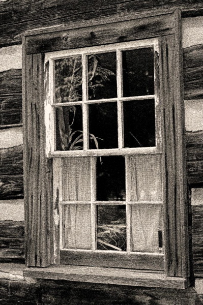 Window Into the Past (obvious symmetry)
Raw and City Night Shots
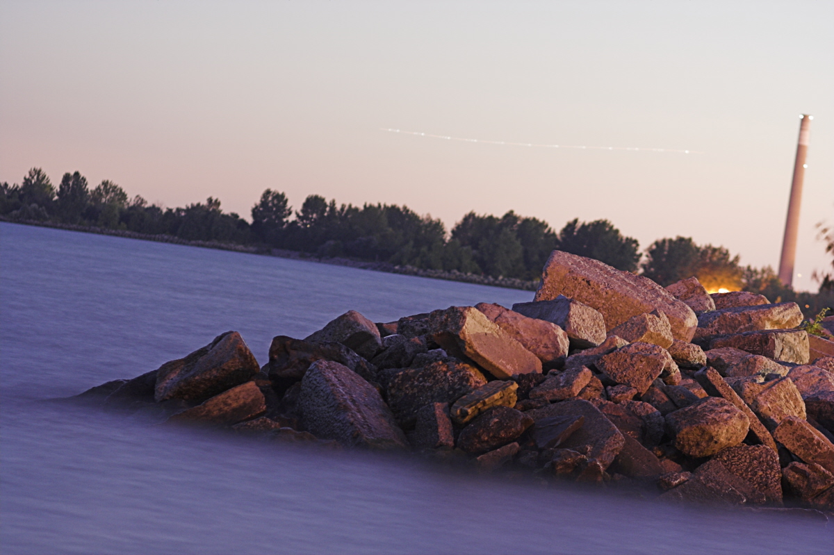 With all the city lights this 100mm @ f2.2 ISO 200 with a 15 Second exposure appears to be shot at midday not as it was 1 hour after sunset. A plane flying by looks like a film scratch.
So the question of the day is why shoot raw? Some reasons not to shot raw: The file is at least 3 times the size. Your computer has to have more memory and power and disk space. Up to recently MS XP needed a special viewer. Extra steps are needed to process the photos. You need to learn more software. It usually at the end is changed to JPEG format anyway.
Up to last Sunday my laptop was just too old and too short of resources to use Raw. How old? NT OS and no USB port that’s how old. Saturday evening it was working. But on Sunday morning the hard drive was going ping ping ping … The usual fix of rebooting and rebooting just resulted in an system error. More drastic methods such as turning it over and shaking (gently) resulted in the screen blinking off and on. Oh well its only money and a new this time a desktop is almost ready to go. After spending 8 hours loading all my legal software and extra drivers, updating XP security flaws and dumping all those special promotional 6o day free software, then the system crashed while removing the after market firewall and using the XP firewall. I hate bloatware plus I hate MS even though I use it. Anyway the system self repaired by reloading itself over all the updated drivers and such. Shades of the 3 week ordeal of loading MS NT on a “NT compliant IBM laptop”. Know only one thing not working and a call to Tech support who if I had followed their instructions would have resulted in the foot being healed and the leg being amputated( I have the log to prove it). Fortunately by not following all their instructions to the letter I removed another usless piece of the manufacturer’s software and XP has been working reliably for 4 days now.
So now I have 500 meg of memory, 200 geg hard drive, two dvd/cd read/write drives, plus a cd read only, multiple usb and flash card readers … and a NEC LCD 17″ monitors that is so clear that I am looking at a color slide projector makes my old monitor seem like I was looking through coke bottles, not to mention stereo speakers that make noises for no apparent reason.
MS is actually fully supporting RAW in the future. Presently you can download Microsoft’s Raw Image and Thumbnailer Viewer. So now I am ready for Raw. Oh yes had to go down to the Toronto Beaches to supplement my current collection of 4 Raw shots.
 A bit of correction makes it look closer to sunset but we lose the fine details of the waves lapping on the rocks.
There is really only one reason to use Raw; its because its the purest form of image that your current camera electronics and software will allow you to record! From when the light hits the lens (maybe before if you are using flash) to when the image shows up on your desktop there are a series of compromises in the signal chain. After the lens the sensor is the first big compromise.
The sensor is the point where the light falling on a pixel is transformed into electrons and accumulated usually as a charge and then read out as a voltage or current. We all know that a image is broken down into pixels but at the sensor each pixel is actually 3 pixels one each with a red, green and blue filter (rgb). Just imagine if we could buy a 24 meg B&W rebel xt, well it would be easy if there were a demand! Because each pixel is broken up into 3 sub pixels the sensor loses 2/3 of the light following on it. Each pixel in the sensor does not have exactly the same sensitivity of it neigbour. Both reducing the noise and the variation of sensitivity between pixels are areas that sensor manufacturers are hard at work trying to improve. On long exposures you might notice a few bright pixels, these are caused by pixels that leak current.
The output from each sub pixel is accessed (read out) is amplified by variable gain amplifier and then converted to a digital number. This number has a precision of x = 10 to 14 bits with a noise level of plus or minus y bits. This noise level is roughly speaking the sum of sensor noise, readout noise, amplifier noise multiplied by the gain of the variable gain amplifier. The gain of the amplifier will increase with ISO setting thus increasing ISO will increases noise.
Patience I have almost got to the RAW part. In the mean time you read this much more complete discussion on RAW from The Luminous Landscape. The camera software takes those x bits per sub pixel and applies some corrections which only the camera software has control over. Next it takes the user selections which includes color conversions, sharpening and lastly output format.
If you select Raw you can bypass all these changes to you image it is important to turn off any spatial filtering (in Canon rebel XT select parameters menu item parameter 2 to turn off filtering) The complete image will now be saved without any additional lose of detail and color information.
If you select JPEG all sorts of spatial and color detail will be lost plus some unwanted artifacts will be added. With JPEG the 3 x bit sub pixal values will be remapped into 3 8-bit bytes using the selected RGB color space. The jpeg compression algorithm will futher mix up the image in subtle spatial ways. Once these spatial details are changed and colors remapped information is lost that can’t be recovered!
If you are shooting for the web JPEG is fine but if the work is more important then use RAW that way you can process the images over and over again. As you get newer, better tool you will always have the highest quality original to work from. For anything other then web you should also always work in 48 bit color or 16 bit B&W. Noise filtering and sharpening should be the last step before saving the image in the color format that you are going to be using for printing. In that way you will never lose precision through arithmetic truncation on 24 bit color 8 bit B&W images.
 Too bad I focused on the backdrop instead of the pier.
This motion blur unlike the images in previous posting does not give a feeling of motion but gives a ghosting effect. Too bad they are not in white.
As you can see in the image above I am still getting use to the work flow and tool set. I use Raw Shooters Essentials 2005 as my Raw processing package. I find its much easier to use and has a better work flow then Canon’s Raw software that came with the camera. People in the know say its one of the best if not the best. Excellent package and so far its free! For the rest I use Picture Window Pro less expensive, not as sophisticated and not as complicated to learn as Photoshop, their website is a very good resource for all things digital photography and color profiles.
One last thing about Raw there has been a call to standardize Raw format, IMHO this will be slow coming, standardized Raw format is almost an oxymoron the whole Idead of Raw is to give the camera owner ability to access the image before it is polluted by layers of conversion software. They may end up standardizing part of raw format but not the manufacturer specific part.
Notes:
- MS raw viewer has a problem with large tiff and some avi files, it locks them and will not unlock them so you can’t move or edit them best to dis the tiff viewing function until the next version comes out O well its from MS next generation will be better I hope.
- Google has a free program called Picasa which does a nice job of finding, html slide shows, backing up and organizing you photos
Toronto Brick Works

Most of older Toronto was built from bricks out of this huge derelict factory located at the base of the Bayview extension in the Don Valley. Evergreen has big plans to redevelop the property while keeping the character of the structure. Some more of my Brickworks Photos
The Creative Colour Challenge
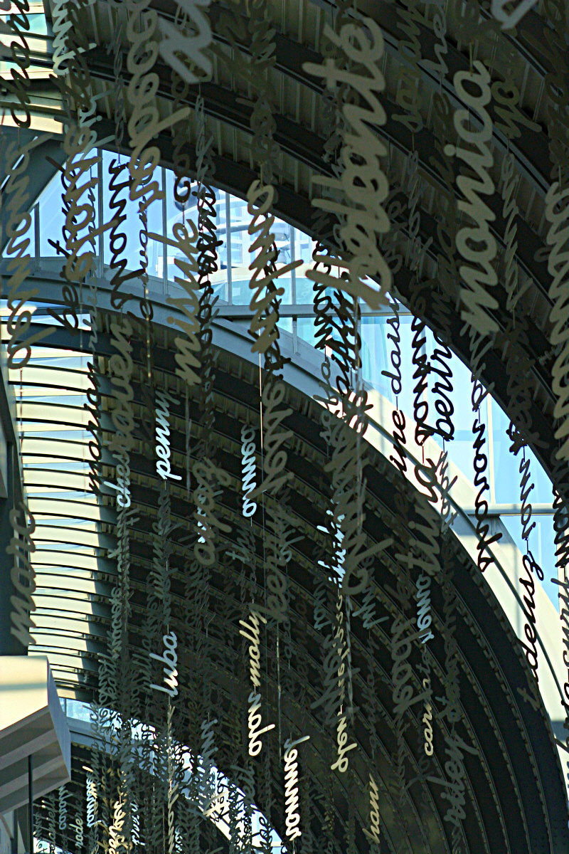 This last Sunday the TPMG went to the CNE with a challenge for the day. As I replied to the posted challenge I choose to loosely interpret plaid as a color 🙂 Some more of my photos shot for the challenge.
Challenge by: Ryan Tacay
“In collaboration with the upcoming event at the CNE this Sunday, I’ve put together another challenge for you guys to participate in. If you choose to accept, your mission this weekend is “The Creative Colour Challenge”. In this challenge you will pick a colour of choice and during the event, hunt for shots that display your chosen colour only. Of course there are certain restrictions to make things a bit harder for you so, here are the rules:
1. You can only use one lens during this challenge – focal lengths, aperture etc. can change but you must choose your lens of choice and stick with it.
2. You have to fill your frame with at least 80% of your chosen colour. None of this, “I choose blue and the sky in the background is blue” stuff lol.
3. Whatever colour you pick, you must stick with for the duration of the day – no switching colours mid-way through or jumping between 2 colours just because it presents itself there at your convenience. The point is to move around and hunt so let’s get going and work up an appetite ’cause you know we’ll be eating again at the end of the day. ;)”
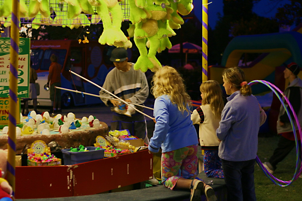
Color is it the same for each of us?
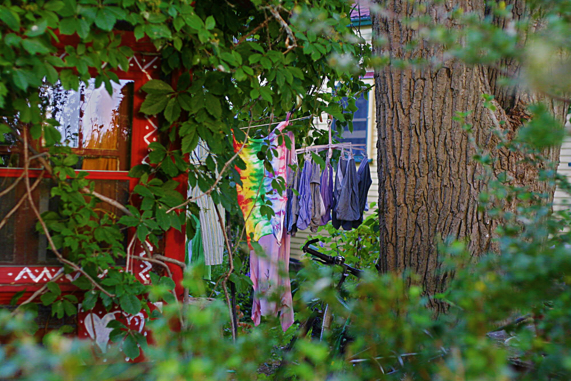 Do we all see colors the same way? The simple answer is no, otherwise why would some people dress in such awful colors. This is not to imply there is anything wrong with the colors of the clothes on this Wards Island clothesline. We also know that some people have various levels of color blindness making it difficult for them to differentiate between colors.
There is often confusion between what we know as color because we can see it with our eyes and the scientific description of color being the wavelength of light in the visible spectrum somewhere in between the short wavelength near-ultraviolet and long near-infrared wavelengths. If a prism was used to split up sunlight the resulting spectrum would look like the diagram below. If we had a light meter to measure the intensity of the light along the x-axis (= wavelength) we would have a spectrometer. The spectrum of the sun is wideband as the sun has light at all wavelengths. If you could look even closer at spectrum you would see very fine peaks and valleys of intensities this is called the fine line spectrum caused by some element of the sun emmitting light. Many sources of man made light but excluding the the good old incandescent light bulb are narrow band emitters having just a few narrow lines in their spectrum, devices such as lasers may have only one narrow line.
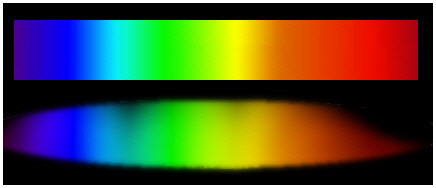 What does this have to do with how we see colors, actually very little. Unlike our ears where we can hear minute differences in frequency (1/wavelength), intensity (volume), in pronunciation and in enunciation (sound envelope) our eyes were not designed for such subtle distinction.
Eyes can only detect 3 wide overlapping frequency bands, our brain merges these inputs together to form our perception of color. These 3 bands as every artist knows are the reflective primary colors of red green blue (RGB). The eye can’t distinguish between a yellow light and mixed red and green lights. But for the mixed red and green light a spectrum analyser would not measure any yellow! The red and green will not pass through a yellow while the true yellow wavelength light will pass right through. To our eye there are millions of ways to form the same shades of yellow. The brain interprets the colors that eye sees in ways that help us deal and make sense of the environment, the colors and color intensities are relative to the surrounding. A red box surrounded by blue will look to be a different shade when it is surrounds by green. Also the brain interprets colors seperate from outlines. We all know that the brain doesn’t care if we color the box and go outside the lines, the box will still look red.
To end this long winded discussion IMHO there is no way that it is possible for each of us to see colors exactly the same way. Also as we don’t reproduce colors using the real spectrum of light but instead use an imitation of our own visual system all media will look different from the original scene and also look different to each individual.
Color, Noise and ISO 1600
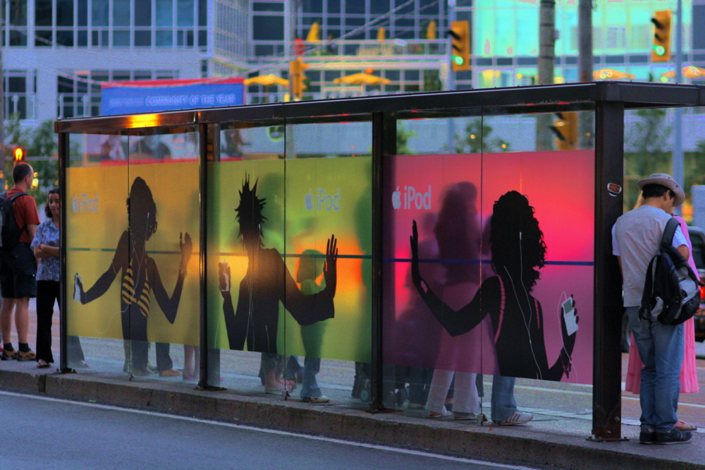 One of the reasons I choose the Canon XT over other camera manufacturers was because of the lower noise levels at higher ISO numbers. Reviews even said the noise levels were similar but with a different look to the more expensive Canon models.
After my return ferry ride from Sunday’s Wards Island trip I decided to take a few early evening shots with my 100mm f2.0 lens. To save the setup of the tripod and also because I had only used it a few times I set the ISO level to the maximum of 1600. In the picture above I was expecdting bright saturated colors but instead they were dull and slightly dirty in a way that could not be corrected with picture window pro (the software I normally use) so much so that I will have to go back and shoot it again with my tripod.
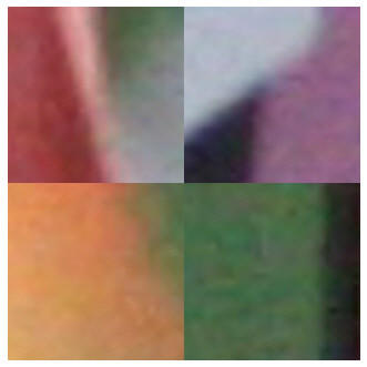 This is a 4x zoom of 4 parts of the top photo: notice the blotchiness of the colors not only in color intensity but in the actual color value. I can attribute some of it to using jpeginstead of raw but I doubt that does much more then smooth out noise spikes. I find the noise more annoying then the graininess of film. Film has most of the noise is uniformly distributed spatially with the noise being primary intensity rather then in color value. Increasing ISO number does not for the most part increase the sensitivity of image sensor it is really only increasing the amplification. Electronic noise causing a lower signal to noise ratio is still the biggest hurdle preventing image sensors from reaching the dynamic range of film. More about color in a future post.
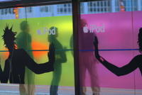 Another Trolly Stop photo
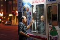 Because color is not so important to the subject matter in this photo I think ISO 1600 is not too bad here.
The Wrong End of the Stick
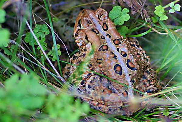
You ask why would I show a picture of the backside of a toad. The answer is simple its the best photo I could get. The toad like most wild animals would rather be invisible when it comes to humankind. Rather then put the creature into shock by prodding with my camera lens, I choose not to disturb it, let it believe its camouflage was successfully concealing it.
Captured in Motion
This past Sunday I took the ferry over to Wards Island to take a few photos. One of my targets for the day was to capture the feeling of motion. Being of a scientific bent of mind. I asked myself the question: What gives a static photograph the impression of motion? As I am wont to do I will attempt to answer my own question by breaking down and classifying motion in photos into two classes. These two classes are not exclusive both could be combined in single photo. More of Sunday’s pictures.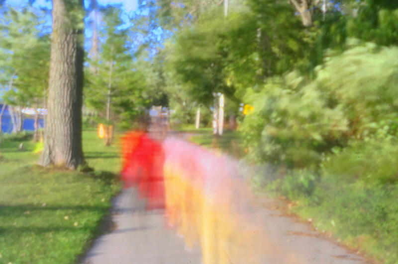 The first class is those photographs that show motion by having motion blur. While a normal photograph is a frozen moment in time. This type of photo has frozen not a single moment but several moments. The photo on the left is the first of my pinhole lens shots that I really like! It was taken at ISO 200 and with a 15 second exposure, it was also very windy so the bushs and tree branches were also in motion. I had to saturate the colors to make the path of the two bicyclists visible. I have subclassed this as a linear motion blur. Another example of linear blur is when the camera is panned to follow a high speed object such as a race car, in this case the race car is fixed in focus while the background has a linear blur.
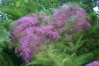 The photo on the right was taken in a heavy gust of wind with my lens stopped right down to maximum and at ISO 100 for a 2 second exposure. This subclass of motion blur for lack of a better name I will call cyclic motion blur. Cyclic because the object when disturbed oscillates around its at rest point. For an instance at both extents of its travel it stops moving giving it the characteristic of a multiple exposure stop motion strobe effect.
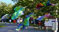 The next class I call perceptual motion. Our brain is hardwired through genetics and through life’s teachings that nature has laws; gravity pulls down an object, if an object is past it’s center of gravity it will fall over, water can’t be put in a pile… We know without thinking that the shirts in the picture are not static but are being blown by the wind. It is not in the nature of a shirt to hang in the way that the photo shows unless there is wind.
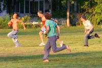 Our mind tells us these people are running not standing still. If they were standing still they would be falling over.
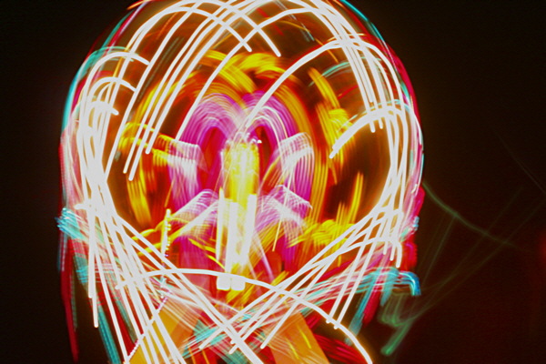
This last example of the cyclic motion blur subclass was of an CNE ride at night.
Ignorance – Dynamic Range – Flash Fill In
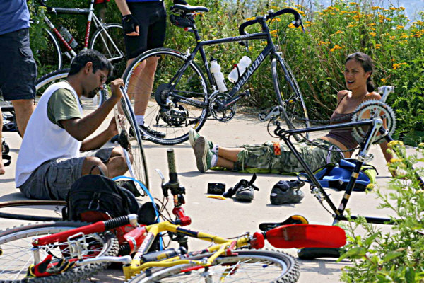 I find one of the big differences of digital photography as compared to film is the reduced dynamic range of digital cameras. This image of a field bike repair was taken at the Leslie Spit. Notice the bright sunlight reflecting off the cement. I am not happy with the light and dark contrast in the above image.
 If the image is too bright to the point that one or more of the color channels are clipped/pegged at its maximum value (which is 1024 for the canon rebel xt). Then areas that are brighter then this max value will lose all of the details. The image on the left has had the brightness increased by 25%.
 On the other hand if the image is too dark then the dynamic range of image is reduced and fine detail is lost. Some of the detail can be brought back by digitally enhancing the image in a program like Photo Shop. This is especially true if you are working in raw mode. But fine detail is still lost and noise especially in the dark areas will be increasingly visible. There is a mathamatical basis beyond the scope of this post for this increase in noise and lose of detail.
The answer to getting better contrast is simple but too late for this time around. It was pointed out to me after the fact that I should have used flash fill-in to bring out the dark areas. I knew about flash fill-in but always thought it was used in lower light situations. In general I stay away from using the flash as I usually get glare off a sweating nose or forehead, but in bright sunlight glare shouldn’t be a problem. Oh well another reason to buy a remote flash.